Nordicos is a duo of freestyle soccer players who offer workshops, shows, and training sessions throughout the Netherlands. Their previous brand identity felt too busy and outdated. They were looking for a visual identity that better reflected their energy: creative, unconventional, yet accessible and professional.
Logo Design
The Challenge
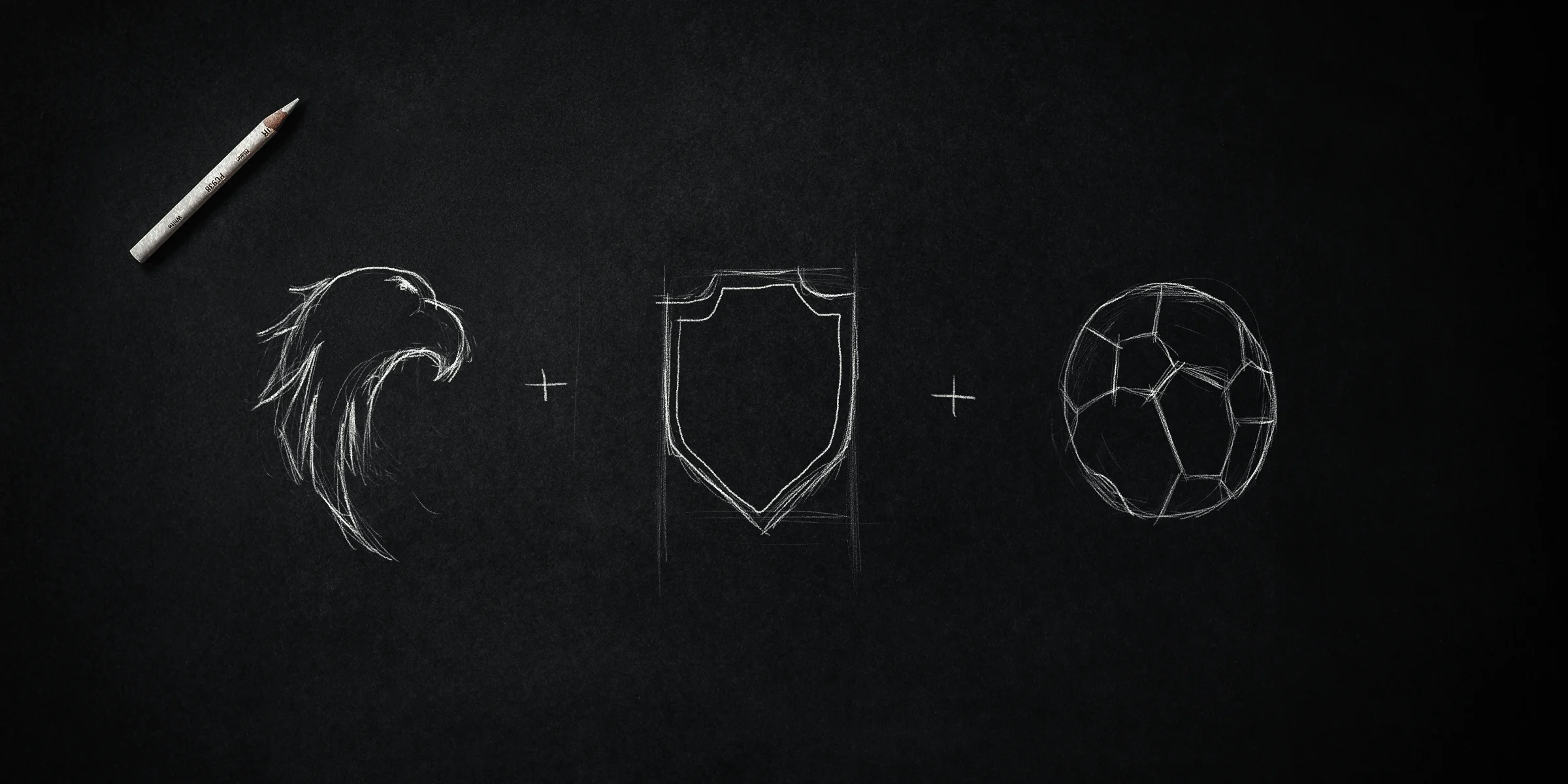
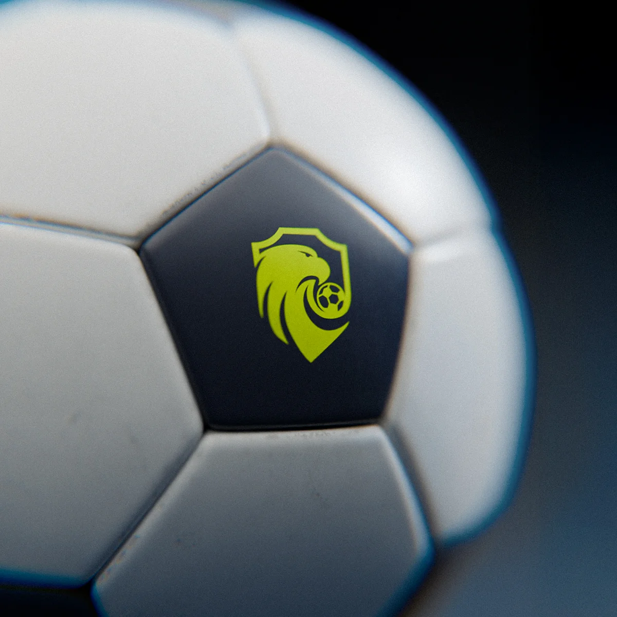
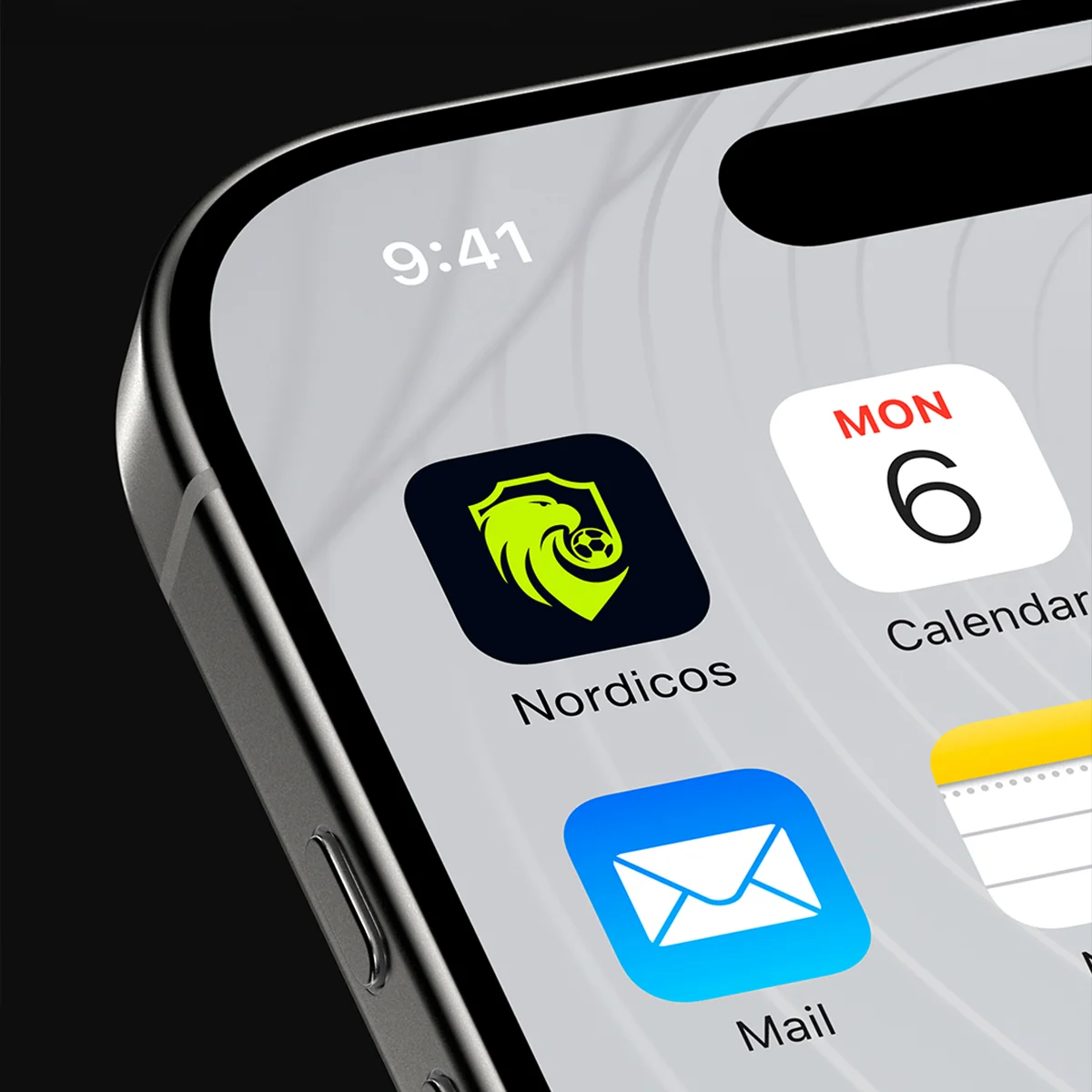
Nordicos’ old logo was too detailed, making it difficult to use on clothing, online, and in print. The assignment was to design a new logo that incorporated three elements: an eagle, a soccer ball, and a shield—and that would remain instantly recognizable even in a simplified form.
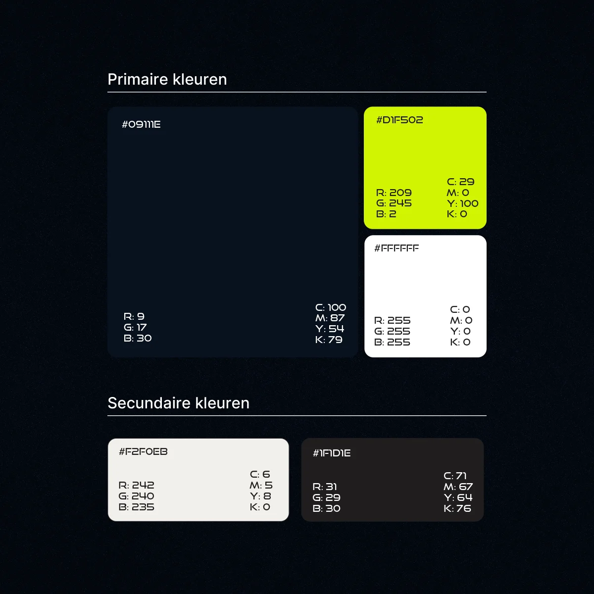
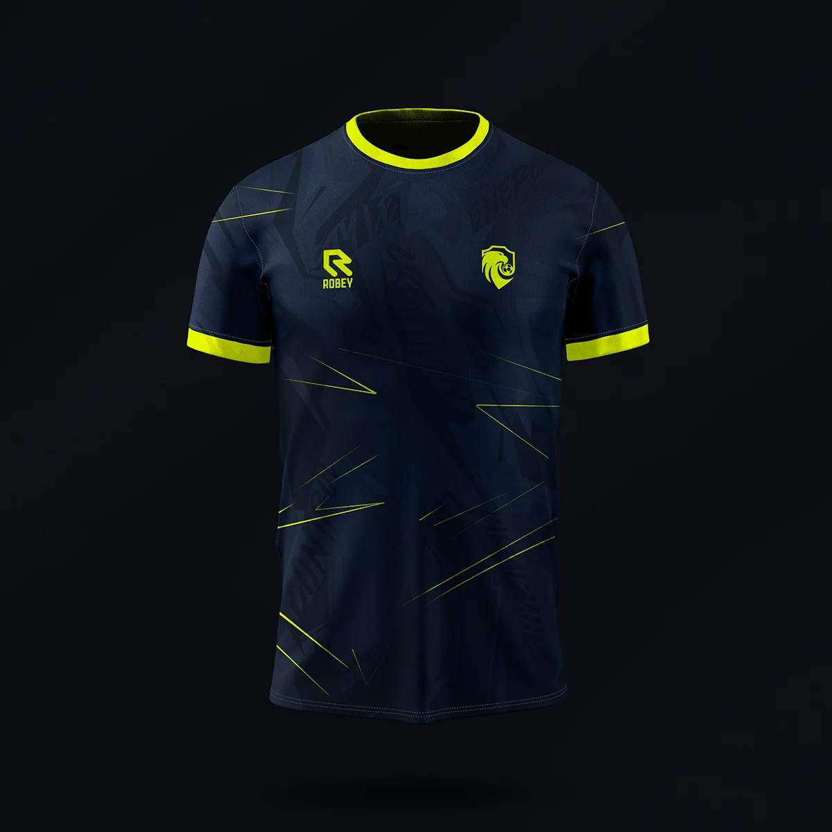
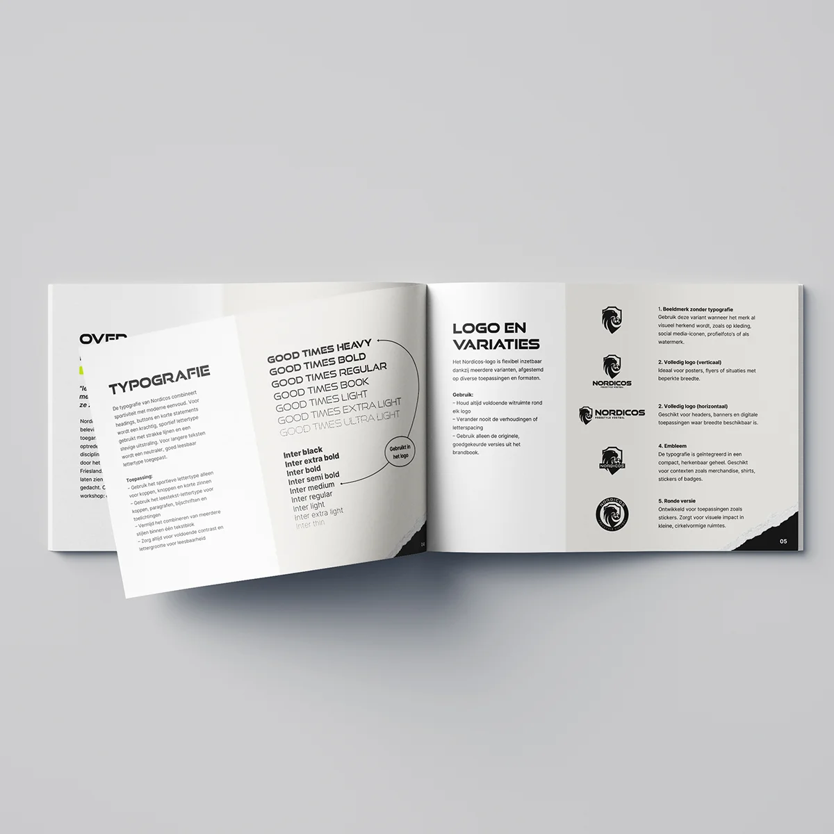
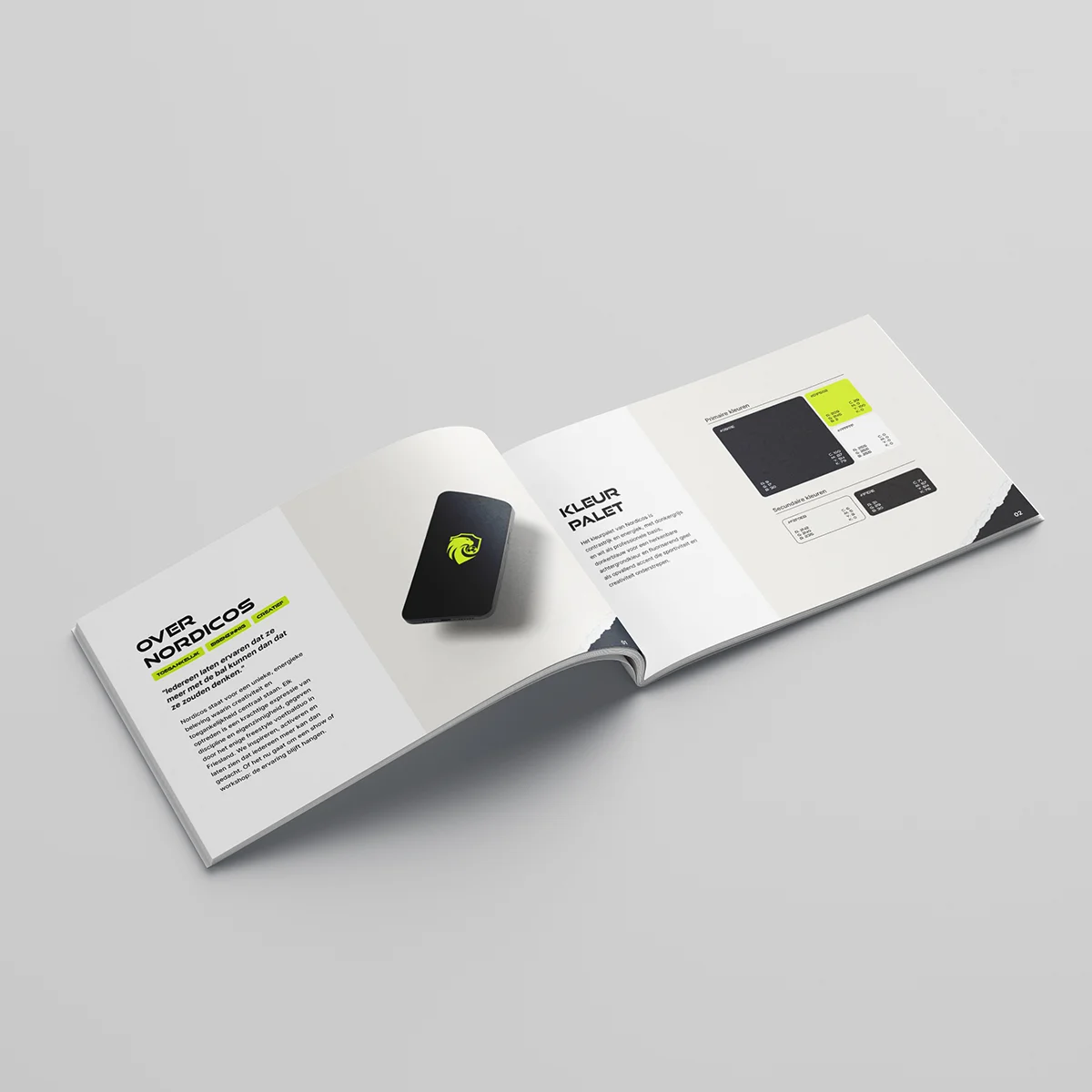
In addition, the brand identity was expanded to include a modern color palette, typography, logo variations, and a new uniform design.
Brand Guidelines Manual
Establishing the corporate identity
To ensure consistent use of the new brand identity, we have documented it in a brand identity manual. This manual describes the logo variations, guidelines, colors, and typography so that external parties can also use them effectively.